Pointed Ambiguity: X Confuses Users With Mystery Hand Graphic Prompting Profile Shares
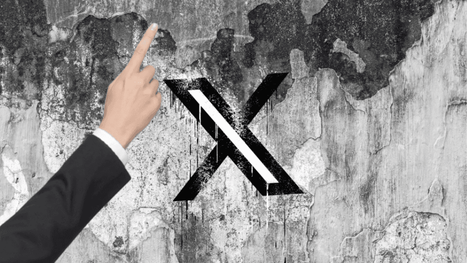
Social media platform X started testing a bizarre UI prompt that encourages people to share peer accounts, leaving users baffled across the site. The feature displays a graphic of a suited hand pointing upward. It appears above user profile cards, post composition screens, and direct messaging interfaces without providing clear context or instructions.
The strange pointing hand icon popped up across mobile apps and web feeds over the past week. Users opening the platform encountered the graphic floating over post composition fields, next to profile handles, or inside chat windows. Because X added no explanatory pop-up text or onboarding tooltips, thousands of account holders posted screenshots asking what the hand meant and why it kept taking over their screens.
Early user testing indicates that tapping the pointing hand graphic triggers a share card designed to promote another user’s profile. When a user clicks the graphic, the platform automatically formats a new post or message tag pointing directly to a featured creator or peer account. The underlying goal appears to be driving organic user discovery and cross-profile engagement across the network.
However, the execution generated immediate confusion and criticism. Many users initially mistook the hand graphic for an error popup, a broken advertisement, or a security warning. Others pointed out that floating a large stock image of a hand wearing a dark suit jacket felt completely out of place inside the platform’s standard design layout.
Unclear feature rollouts often backfire on major social networks. Adding mysterious visual prompts without clear text labels confuses everyday users and reduces trust in platform updates. When people cannot tell if a visual element is a legitimate feature or a glitch, they avoid clicking it entirely.
X has a history of testing experimental UI tweaks directly in production environments without advance notice. While fast-paced product updates allow teams to test new ideas quickly, dropping unexplained visual popups onto millions of active feeds creates widespread friction.
To make account promotion features work, X needs clear, intuitive design patterns. Swapping out mysterious graphics for labeled buttons or explicit calls to action helps users understand what happens when they click. Until X clarifies the pointing hand prompt or cleans up its interface, users will keep questioning the purpose behind the platform’s latest design experiment.